The One Thing That Was Holding Me Back in Notion (And How I Solved It)
I use Notion. A lot. However, there was a feature that I felt was missing and it bothered me. A lot.
Notion is the tool I use to manage my university resources, information overload and just for writing down my thoughts from time to time. However, there was one problem that I had with Notion and it was a big one for me.
The problem
In short: the databases and their views.
I like tags, dates, and organised data but I’d also love to see all my data entries in form of a toggle list. I like to give importance to some topics like writing about my recent experience with something (or someone 🙃).
The databases in Notion can be seen like this:
While I like the aesthetics and ability to put multi-select tags, status quo, and relations with elements from other databases into elements, I also wanted something like this:
Basically, I wanted to be able to view the database elements (let’s say data entries of what happened in my day) in the form of toggle lists like in the image right above.
While this problem may seem like just a childish fetish, it actually prompted me to consider trying out a new platform altogether. And I did [consider them].
The Possible Solutions
My first solution was to pretend it wasn’t a problem at all. Neat, right?
I then thought of writing some code that can fetch data from the database and then render that data in form of a toggle list inside Notion. However, it would require making API calls not just from Notion but into Notion as well. And as you can probably guess, that’s not possible. Not yet.
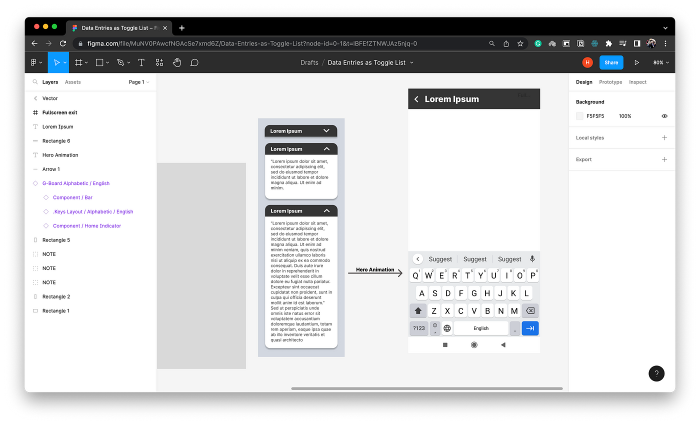
My third approach was to make a new app altogether. I went on to design a completely new app that would fetch all my data entries using Notion API (I love their collaborative approach) and display them in the form of toggle lists like I wanted. I already knew how to build apps with Flutter and working with Notion API wouldn’t have been that hard.
I agree it’s not the best design. It’s not even complete. I think I would add a floating action button to start writing a new note and there will be a settings page and some kind of navigation to it.
While making a new app sounded exciting, it also made me question whether I needed Notion at all.
The Exploration
I started looking for an alternative to Notion because of some little problems and the one big problem that I wrote this article about. I came across this video on Tiago Forte’s channel where he was discussing Obsidian with an expert. They talk about various features and rate Obsidian on a scale of 0 to 10 for that particular feature.
The second feature they talked about was something that exists in Notion and always has, but I just hadn’t thought of using it this way. And as it turns out, that feature what exactly what I needed.
The Solution that Worked
In short: Synced Block.
As I said, Synced Blocks have existed in Notion forever and I’ve used them a fair number of times. I just never thought of them this way.
So the idea is to make a new data entry and put all of its content inside a synced block in it.
Then you go to another page, where all your toggle lists are, and you make a new toggle list item and add the heading of the data entry and paste the link to that synced block inside the toggle. This way, whenever you update the data entry in the database, the changes will reflect in the toggle list page as well (and vice versa).
It’s surprising how this feature has been in front of my eyes all along, yet I didn’t realize its full potential until now.
I can’t help but feel a bit ignorant for not recognizing it sooner, but at the same time, I’m just happy that I’ve finally found the solution to a problem that has been bothering me for a while.


